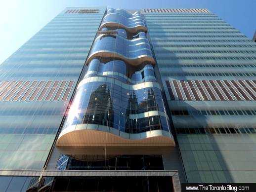
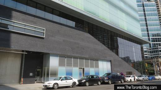
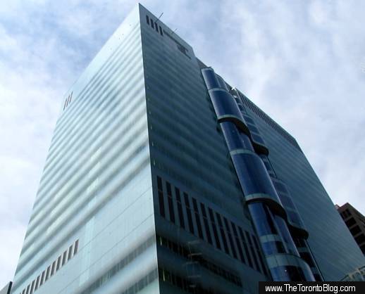
September 11 2013: The SickKids Tower viewed from the south. The building was designed by Diamond Schmitt Architects in association with HDR Architecture.
Tallest building of its kind in the world
The tallest and most modern building of its kind in the world, the 750,000 square foot Centre boasts 21 floors of flexible laboratory areas, meeting rooms and educational facilities. Street-level space for restaurant and retail uses, three levels of underground parking, and mechanical equipment on the 22nd level round out the 119-meter tall tower, which is clad with 4,500 zinc panels and 12,125 panes of glass.
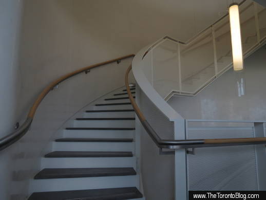
Inside, the Centre is configured into six separate research “neighbourhoods” — Brain & Behaviour; Organ Systems & Disease; Patients, Populations & Policy; Genetic & Genomic Medicine; Cancer & Stem Cell Biology; and Molecules, Cells & Therapies — each of which occupies two to three floors. The individual floors are linked by staircases in soaring atrium spaces that cantilever above Bay Street on the tower’s east side.
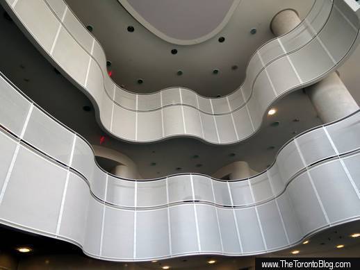
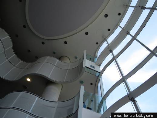
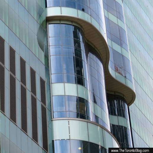
The most striking architectural feature of the building exterior, the dramatically curved atria windows rise from the 5th floor up to the 21st, dividing the east wall’s wide, flat expanse of fritted glass with an eye-catching tall column of waves. The interior of the atrium spaces is even more exhilarating, offering breathtaking views right up and down Bay Street. Containing spacious meeting rooms and lounges, the light-filled, multilevel gathering spaces were designed to foster communication and collaboration, and to inspire creative thinking.
A signature feature of the tower design is the stack of six multilevel atria that cantilever above Bay Street on the building’s east side
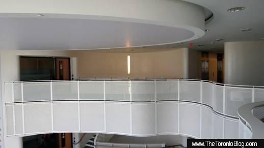
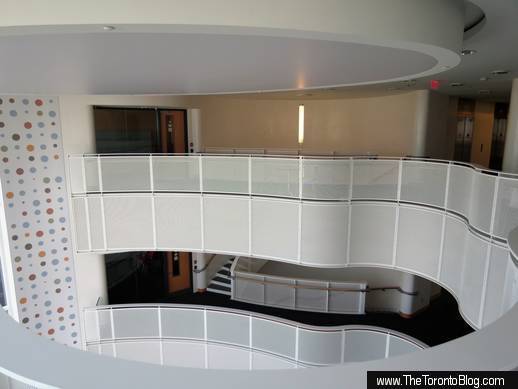
Part of the upper level of the atrium for the Development and Stem Cell Biology “neighbourhood,” which occupies floors 15 through 18
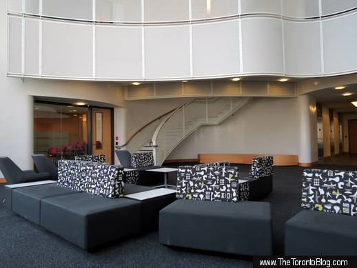
The atrium contains meeting rooms and lounge areas
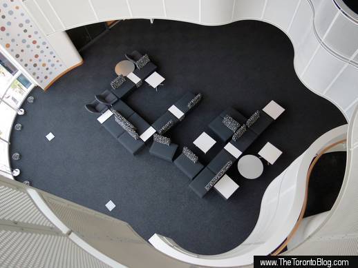
Looking down at the main lounge area in the atrium
The fluid curves of the atrium interior remind me of some of the crystal vases that Alvar Aalto designed for the iittala crystal company in Finland
Staircases connect the floors within each atrium
Comfy seating arrangements aim to encourage conversation and foster collaboration among the scientists and research professionals
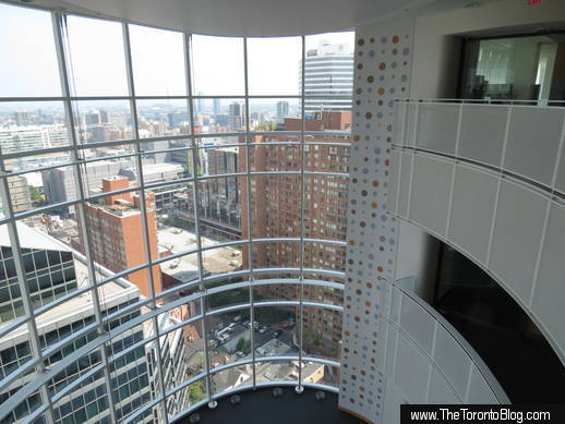
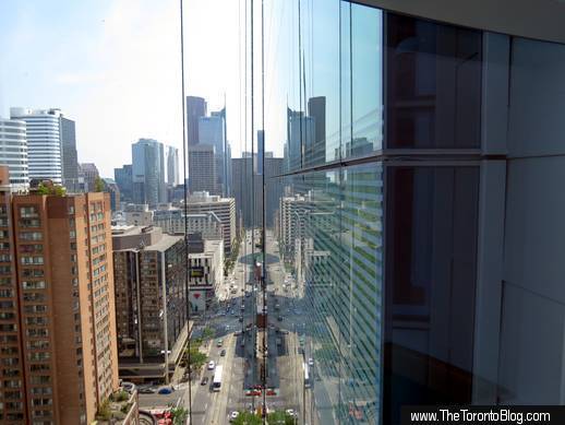
The atrium windows offer sweeping views of the sky …
… the Aura condo tower under construction to the northeast …
… office and condo towers on the east side of Bay Street…
… residential and commercials buildings in the southeast downtown …
… as well as the Financial District towers farther south on Bay Street
Spirited, bold curves abound in each atrium …
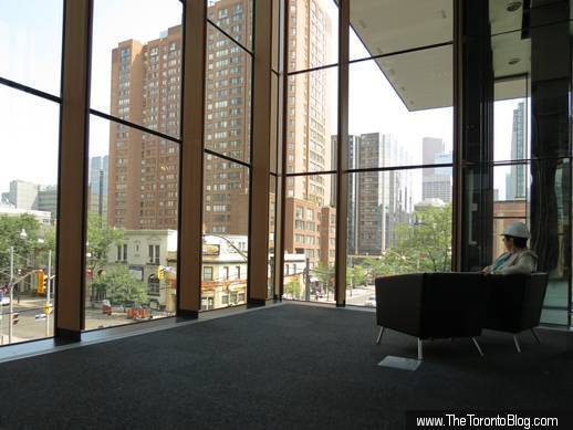
… while the ultra-clear low-iron glass windows let in lots of light while offering superb views of the city
Architects Don Schmitt (left) and Duncan Higgins (center right) explain features of the SickKids building during a media tour stop in one of the atrium spaces
Natural light reaches most interior spaces
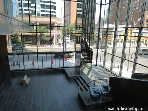
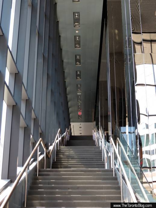
The laboratory, office and work areas in each neighbourhood are almost as bright as the atria, since the low-iron glass windows let natural light penetrate deep into each floor, reaching more than 90 per cent of the interior spaces. Meanwhile, down at street level, the 3-storey glass walls on the building’s southeast corner give passersby a glimpse of the lobby and an impressive grand staircase that leads to a mezzanine-level amphitheatre, a 250-seat auditorium, tele-education facilities and administrative offices.
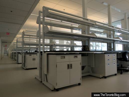
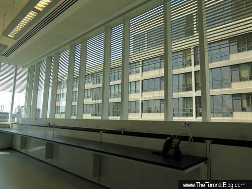
About 70% of the building comprises lab spaces, like this one. Each floor of “dry” laboratories has 140 work spaces. HDR Architecture provided the lab planning and design services for the tower.
All of the workstations are portable and can be wheeled into new configurations or easily moved out altogether should future changes in research and technology require alterations to the work space
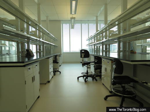
Like each neighbourhood atrium, each lab floor is bright and cheery — natural light reaches 90% of interior spaces in the building
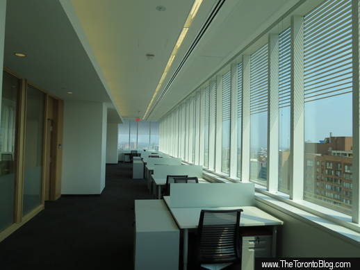
A row of desks along a south-facing set of windows. These “hot” desks will not be permanently assigned to staff, but will be available for use on an as-needed basis. Managers will work in glass-walled offices (left) set back from the windows.
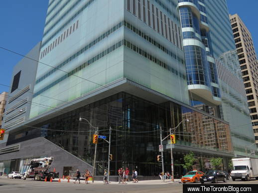
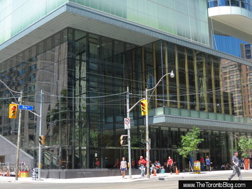
3-storey-tall windows on the building’s southeast corner open the lobby and Grand Stair to public view from the Bay & Elm intersection
Behind the soaring windows are the lobby and the Grand Stair that leads to an amphitheatre, auditorium, tele-education facilities, administrative offices, and a passageway to adjacent SickKids buildings
The lobby will be accessible to the public. Displays and events will be held from time to time to show the community the work being done in the building
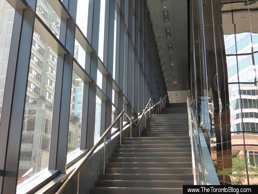
The Grand Stair leads to an amphitheatre, an auditorium, and a passageway to adjacent SickKids buildings. There are about 65 steps on the staircase.
The Grand Stair extends across the south side of the tower, and is visible to passersby on the street
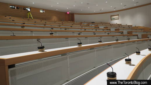
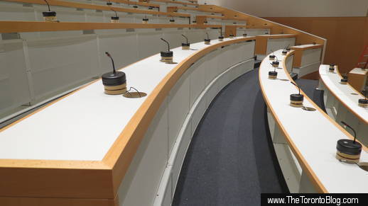
The stairs lead to an amphitheatre that will be used for educational purposes as well as events open to the public. The amphitheatre offers this view toward the soaring lobby area.
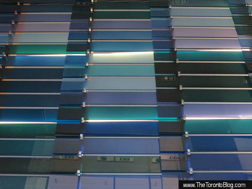
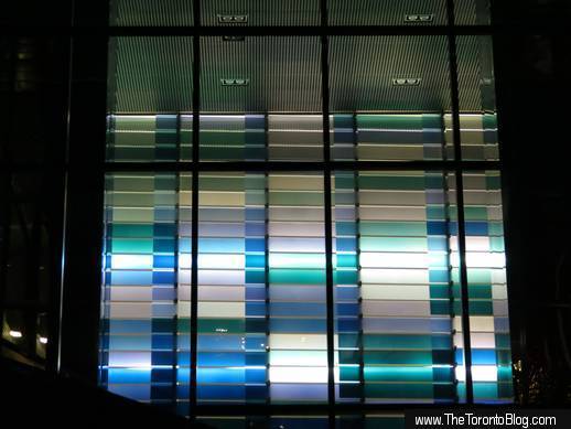
The coloured glass panels on this wall will be engraved with names of contributors to the Centre’s $200 million fundraising campaign
At night, the illuminated donor panel is highly visible from the street
The tower boasts a 250-seat auditorium at the top of the Grand Stair
State-of-the-art telecommunications facilities, like the auditorium, will let the Centre’s staff collaborate and share information with research scientists and professionals around the globe
SickKids President Mary Jo Haddad checks out the downtown views from a lounge area accessed from the Grand Stair
Passersby make positive comments about the Centre’s design
Throughout the Centre’s construction, I have been asking friends and passersby on the street to give me their opinions about how the building looks, and to tell me how they feel when walking by it on either Bay or Elm Street. People have frequently remarked that, even though the building is huge, it doesn’t overwhelm the street and actually improves the pedestrian experience. Some said they have noticed that the Centre appears to have brightened the highrise “canyon” between Elm and Gerrard Streets, while others have told me they appreciate the canopy that offers pedestrians some protection from the elements as they walk along the tower’s east side.
A view of the south side of the Centre, along Elm Street. A variety of textures and cladding materials on this part of the building contrasts with the glass exterior on the other three sides.
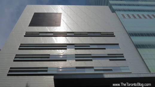
Looking up at the southwest corner wing of the Centre
A design detail on the lower southwest side of the building
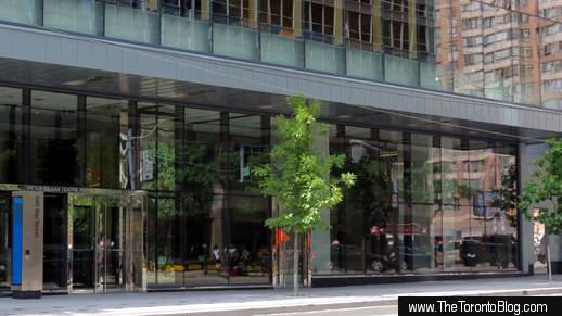
A canopy extends above most of the Bay Street sidewalk on the east side of the building, offering pedestrian protection from bad weather and bright sunshine
Another view of the Bay Street sidewalk next to the SickKids Tower
‘Light’ look and curvy windows catch attention
One friend told me he particularly likes the bright, “light” look of the building, which he called a welcome change from the hulking and “heavy” institutional buildings of the 1970s, like Mount Sinai Hospital which dominates the University Avenue streetscape just two blocks away.
And most people have told me they like the rolling glass walls of the atria, which they variously described as “cool,” “fun,” and “interesting,” as well as a refreshing design departure from the “typical,” “boring” and “boxy” condo towers under construction across the city. Most say they’re curious about what’s behind those curvy windows, just as I was while watching the building go up. As you’ve probably gathered from the photos posted above, I finally got to see for myself during a recent media tour of the Centre led by Don Schmitt and Duncan Higgins of Diamond Schmitt Architects, and by SickKids President Mary Jo Haddad.
Passersby have commented that the building, though quite large, has a light and airy feel that doesn’t overwhelm the surrounding streets and neighbourhood
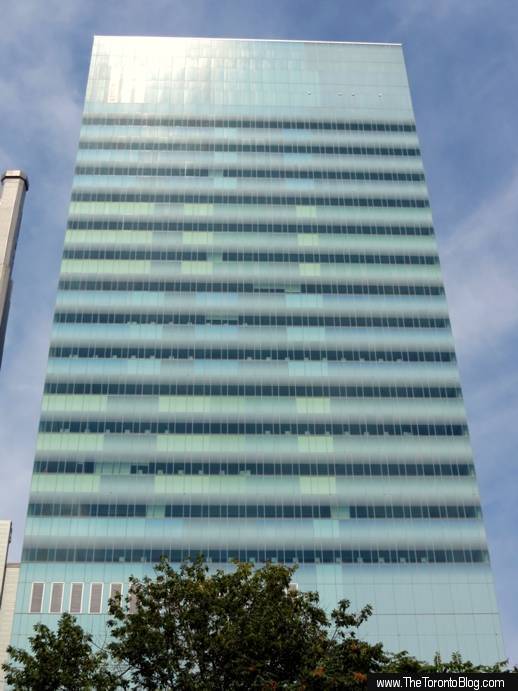
Looking up the 22-storey building from across the road at the southeast corner of Bay and Elm Streets
The wavy windows of the atrium spaces for the six research neighbourhoods catch the eye of passersby, who find the curves a refreshing change from flat glass box condo towers that dominate the downtown skyline
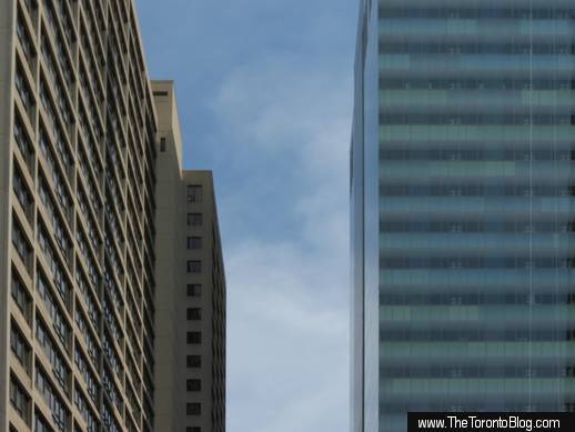
The luminous glass tower is quite large, but has a “light” look compared to concrete highrises like the LuCliff Place office and residential tower (left) on the north side of Walton Street. I find the SickKids Tower often has a mirage-like appearance as it shimmers in the sunshine.
Project was in the works for over a decade
Ms Haddad explained that plans for the new building had been in the works for well over a decade and a half, but it wasn’t until several years ago that the hospital finally found itself in a position to proceed with the ambitious project. SickKids undertook a competitive bidding process to select its architects, and six different teams participated.
Mr Schmitt said Diamond Schmitt won the contract with an under-budget bid, then spent about three years designing the Centre in association with HDR Architecture. Diamond Schmitt designed the tower building as well as its main interior spaces, while a team from HDR designed and planned the laboratories, which make up approximately 70% of the tower. HDR also contributed equipment planning, security, and interior design services.
Noting that SickKids is remarkable for the health care it provides, Mr Schmitt said the architects employed innovative approaches to design equally remarkable laboratory, learning and meeting spaces. Facilities were designed and organized to be as flexible as possible so that offices and labs can be moved or reconfigured relatively easily should future changes in technology or research techniques require the spaces to be adapted for new uses, functions and equipment. For instance, all of the 140 work stations on each “dry” lab floor are portable and can be moved, removed or replaced as circumstances may require.
In a media release, Clare Swanson, HDR’s principal laboratory planner described the SickKids tower as “a unique facility in that it integrates many different research types (vivarium, fish, imaging, biology, chemistry, robotics, etc.) within the building. We’ll often design research buildings to include one of these research types, but the sheer volume of labs and the differentiation in research within this building is impressive.”
Mr Schmitt added that, since research and patient care are integral to SickKids, the architects strove to strengthen the physical connection between the research benches and hospital beds. This was achieved by linking the Centre — which has no beds, since it is purely a research and learning facility — to the adjacent SickKids McMaster Building and Slaight Family Atrium through a third-floor path accessed from the grand staircase visible through the glass lobby walls.
Building design aims to demystify research and science
Ms Haddad said another design goal the architects achieved was to “bring research to the street” by letting the community see what’s happening inside the building. Displays and events in publicly accessible spaces in the lobby and lower levels will also help demystify the child health research process.
Ms Haddad and Mr Schmitt both noted that the new building will bring tremendous benefits not only to SickKids, but also to the City of Toronto and to medical research around the world.
Mr Schmitt said the building will strengthen and enhance Toronto’s status as a leading centre for health sciences research, and will also have a big economic impact on the city. And thanks to its state-of-the-art telecommunications facilities, he said, the building will become an important educational hub for the Centre and its research partners around the world.
Centre will have an impact on research around the world
Although Ms Haddad was effusive with praise for the architecture and design, frequently calling it “phenomenal,” “stunning” and “spectacular,” she noted that, at the end of the day, “it’s not about the building, it’s about what’s going to happen in here.” She predicts the work done inside the Centre will change the child health research landscape internationally.
The Peter Gilgan Centre cost $400 million to construct and equip. The hospital raised the necessary funds through long term borrowing (Ms Haddad said some of the debentures have already been paid off), support from all three levels of government (including $91.1 million from the Canada Foundation for Innovation), and a $200 million fundraising campaign which has reached more than 90% of its goal to date. The building has been named after lead donor Peter Gilgan, the founder and CEO of Mattamy Homes, who gave a $40 million gift to support the construction and ongoing operating costs.
The Centre’s September 17 grand opening will mark the conclusion of construction and the end of just the first phase of an onging redevelopment program for SickKids. The hospital is working with Diamond Schmitt Architects on plans for redeveloping the original SickKids hospital building as well as older facilities on the SickKids campus.
Below is a link to the SickKids Tower album on TheTorontoBlog.com’s Flickr page. It contains dozens more photos of the tower’s exterior and interior, along with full-size versions of the pictures posted above.
Click here to view full-size images from the Flickr album


