A new three-storey glass entrance cube will welcome library visitors
One for the books: I love books, but I have never liked the 34-year-old Toronto Reference Library on Yonge north of Bloor. In fact, I could count on one hand the number of times I’ve been inside the place, but for me that has been enough. The library’s soaring central atrium always impresses me at first, but within minutes something about the look and feel of the interior makes me uncomfortable and downright depressed. I can’t put a finger on what bothers me, but once I’m inside I can’t wait to get out.
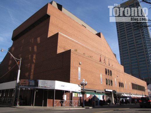
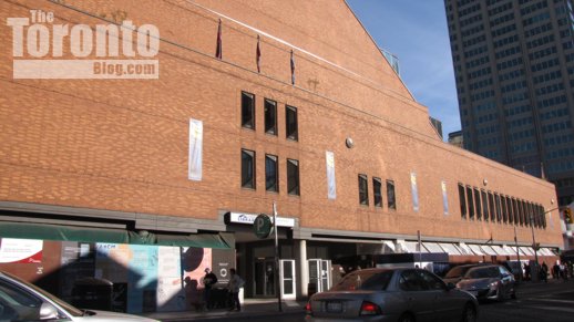
I’m not a big fan of the library’s vast brick fortress-like exterior, either. Although the building looks interesting and cool from some angles, it looms over a full block of Yonge Street with a hulking, brooding presence. I’ve never enjoyed walking past what feels to me like a prison for books; at street level, the facade is unwelcoming — dark and dreary, with nothing inviting to encourage passersby to enter and explore the literary treasures inside. But I’m hoping that will soon change with ambitious renovations currently underway to the entrance and facade — part of a five-year, $34-million “revitalization” program that’s supposed to finish in 2012.
Revitalization will connect the library to the street
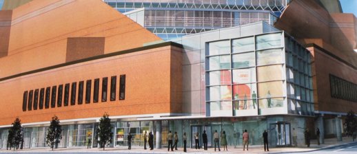
According to a library website announcement detailing all the renovations and changes, the revitalization aims to create “a dynamic interface between the library and its community, connecting the library’s interior more directly to the street, and the public to the services inside.” The three biggest changes to the building exterior will include construction of a three-storey glass entrance “cube,” a glass wall running the full length of the library’s facade along Yonge, and a street-level library retail store and cafe.
Opening up that dark facade to let light into the library while adding some life and energy to the sidewalk sounds terrific to me; those renovations should address my biggest beefs about the building. Many significant changes are happening inside, too; they’re all outlined at the website link above. Will they improve the atmosphere I find so oppressing? Guess I’ll have to wait and see.
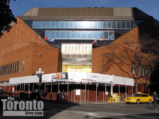
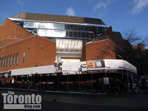
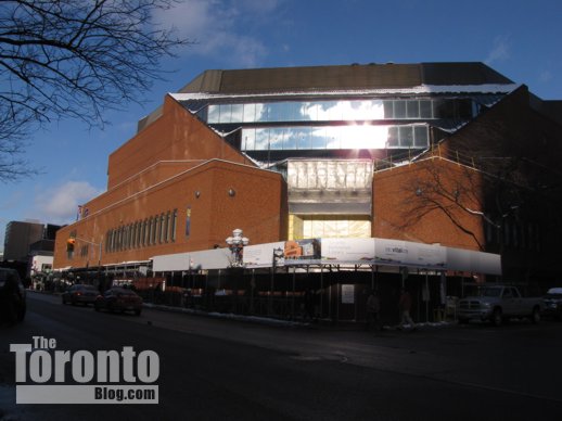
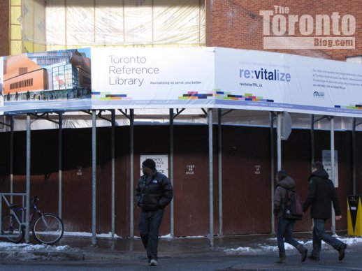
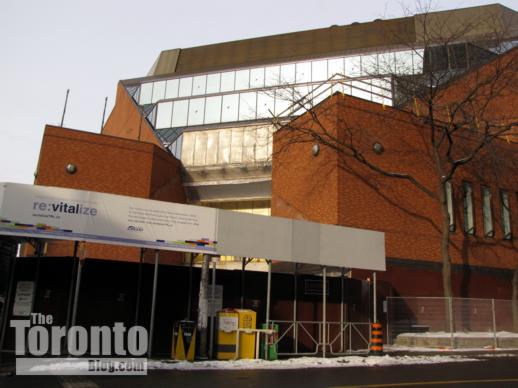
As for the exterior, I was happy to see hoarding erected around the library’s ground level in late 2010, a sign that the facade improvements were finally beginning. However, I have walked past at least three times since it went up, and haven’t yet heard any construction noise. The first time, a friend and I were halfway down the block before we realized we were walking under scaffolding; sadly, it didn’t feel much different than before the facade was boarded up. I have noticed that brickwork on some parts of the facade has been removed, though, so I’m hoping the project is proceeding on schedule. And you can bet I’ll be looking forward to the day the hoarding comes down and the new facade is revealed.
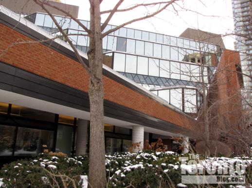
The architect behind the project is Ajon Moriyama of Toronto’s Moriyama and Teshima architects. Since Ajon is the son of Raymond Moriyama, the library’s original architect, it will be interesting to see how he improves on his dad’s design. Below is an architects’ rendering of the entrance cube and street-level glass facade, along with some photos I took recently of the building exterior.
Architectural rendering of Toronto Reference Library facade renovations
Toronto Reference Library Yonge Street facade November 11 2010
Toronto Reference Library Yonge Street facade November 11 2010
Toronto Reference Library Yonge Street facade January 9 2011
Toronto Reference Library Yonge Street facade January 9 2011
Toronto Reference Library main entrance under renovation January 9 2011
Toronto Reference Library Collier Street facade January 24 2011
Toronto Reference Library entrance cube construction January 24 2011


Pingback: New cube entrance now open at Toronto Reference Library | www.TheTorontoBlog.com